Showing posts with label Archival Works Friday. Show all posts

Friday, July 1, 2022

Archival Works Friday for July (July already???!!!!)

 It's Archival Works Friday!!!

The next post for "Archived Works Friday” originated from a sighting and photograph taken in NE Kansas in the summer of 1976.

As I mentioned before - I'll post a painting, drawing or serigraph (silkscreen prints) from the "archive" files of years past...and give a little back story on the work - the first Friday of the month. I hope you'll find it interesting!

I wasn't real familiar with birds of the grasslands or prairies early on...I grew up in a river valley with plenty of woodlands to explore and the birds found in that habitat were birds I grew up with.

Back in the mid 1970's we lived in the Kansas City area (Lenexa – then Shawnee), and spent what little free time we had exploring the Flint Hills and down along the eastern border and around Marais des Cygnes...all neat places. One day we were along an old railroad bed and a Dickcissel was singing away. Believe it or not – I “thought” I knew what that bird was but wasn't sure so tried getting a shot of it (shooting color slide film back in those days).

Although using a 400mm lens at the time, it was still not close enough and the slide film image wasn't the best...but there was a “seed” of an idea germinating way back then – the bird's pose was visually interesting enough to keep in my files for some future use.


It wasn't until 30 years later that I finally put an idea down on paper in color pencil...and the “study” drawing of a male Dickcissel singing was born -


"Summer Song - Dickcissel" - color pencil drawing (In the permanent drawing collection of the Leigh Yawkey Woodson Art Museum, Wausau, WI) - © Bruce A. Morrison

About 10 years later I used the original sketch as a reference for adding to a prairie landscape I titled - "Prairie Song, Dickcissel" - color pencil drawing - © Bruce A. Morrison; now residing in a private collection in Minnesota.

I've been posting some about Dickcissels here on the acreage a fair bit this past month – I have grown extremely fond of them and have been having some preliminary thoughts in my head about doing something with them again; this time also as a tribute to this little grassland obligate. We'll see what comes of that in the near future I hope...love these little “Barking Dogs” of the Prairie!

Thank you for reading along!

Hope to see you on the Tallgrass!

Friday, May 6, 2022

"Archival Works Friday" No. 8!


"Archival Works Friday" No. 8!

The next post for "Archival Works Friday" hearkens back 12 and then 7 years ago.

As I mentioned before - I'll post a painting, drawing or serigraph (silkscreen print) from the archive files of years past...and give a little back story on the work. I hope you'll find it interesting!

This post involves acceptance and rejection. Acceptance - something every artist craves...heck, something every human being craves! And rejection - something we are all familiar with at some time in our lives, unless amnesia's involved.

As far as art is concerned, I first became acquainted with these "rival aspects" back in art school. I remember so well, the class critiques...your work was put up for display in front of the class and sometimes other students were respectful and kind (or sympathetic) and then there were times you'd wished you overslept and missed class!!!! The most dreaded critiques were from visiting professors; you could seriously doubt your choice of career after one of those. But being critiqued wasn't just a learning experience, it was also character building - you sure learned what other artists thought about your work! Ha! It got pretty hairy at times - a lot of fragile egos out in the art world!

It takes many years for some of us to find ourselves...to really start to believe in oneself and create your own "look" or niche. But you also realize that your work is not for everyone. That can be a form of rejection to some, but hey you can't please them all and that's just the way it should be. Wouldn't it be boring if everyone liked the same thing! I could rattle off some very "commercially" successful artist's names that I wouldn't want on my walls - its all personal taste right?! But to have someone like your work enough to "invest" in it is something that makes all those years of plying yourself worthwhile.

Acceptance and rejection are always a fact of life for artists - even for old ones! I'll share a story of acceptance - then rejection - Then overwhelming acceptance. It was neat...then disappointing...then very gratifying.
 
"July in the Valley" - plein air oil painting
(6X8")
 
The example in question began with a small 6X8 plein air painting of the valley out in front of the house and studio one July 12 years ago The sky was just amazing to watch, as it so often is out here. I titled the small painting "July in the Valley" and was very pleased with it. Plein air painting (sometimes termed "pochades") are paintings done outside at the actual location, and are often done just as "studies"...sometimes to "test the water" for a larger painting maybe to be done later on.

This small painting was spotted on the studio gallery wall and purchased by another artist from eastern Iowa, a retired architect. I was very pleased this person was so taken by this small painting! Acceptance is good!
 
"July in the Valley" - studio painting
(12X16")
 
A couple years after this sale was made I had another visitor to the studio. This was a local/area person that had been to the studio before and a former customer. (I'll keep this customer "vague" so as not to shine a light on anyone.) The visitor remembered the small plein air painting that had been sold to the artist I mentioned, and the visitor knew I was thinking of doing a larger painting in the studio of this same scene. I told the visitor that I would alert them when the painting was finished and that they had first dibs if they wanted it. Well some time passed and I finally got to the painting, eventually finished it, and notified the potential client. The potential client came out to the studio and I showed them the painting, the painting was accepted and was purchased. Now it would be normal and nice if things ended here. But several weeks later the client called and asked if they could return the painting...they sounded uneasy but I graciously accepted the return and refunded the purchase price. I felt bad but could tell the client was embarrassed...I won't go into their reason but it was a bit "out there". But that's life right?! Rejection is not fun.

Rejection can often cause a person to question things...is the painting a good work? Am I missing something? But I've learned over the years to not get too rattled when things don't come out quite like I expected.

The studio painting took it's place on the studio wall, right along with other paintings - for the next couple years.

Down the road I submitted this painting, along with two others, to EMC Insurance Corporate office in Des Moines for consideration for their Corporate Art Collection of Iowa Artists. EMC has a neat way of adding artist's works to their collection - they let their employees vote on their choice! After the works submitted for their collection had gone through several EMC employee committees to narrow down the choices - I was notified that "All 3" of my paintings had been over whelming accepted!! Again - acceptance is good!!!

It felt like a win for me, especially since multiple people and committees had "wanted" this painting...sure, one person thought it wasn't right for them personally after a while, but now it was a favorite of many, over and above a lot of other artists that had submitted work! And, oh ya - they also wanted my other two paintings as well...that was REAL acceptance!

So now my studio painting "July in the Valley", and the two others, are part of the EMC Insurance Corporation's EMC Art Collection (as well as one other from 3 years earlier), and I still plug along and strive to do my best. But I know that whatever I do...painting, drawing serigraph or even my photography - aren't everyone's cup of tea, nor do I expect them to be. And I also know that having work purchased by clients is a very good feeling, one that will never grow old.

Thank You, all of my past and present friends and clients, for giving something from my life a good home!

Friday, April 1, 2022

Archival Friday - Post No.7!

As I mentioned before - I'll post a painting, drawing or serigraph (silkscreen prints) from the "archive" files of years past...and give a little back story on the work. I hope you'll find it interesting!

These posts are now on the first Friday of the month – lo and behold this one happens on April Fools Day! Ha! Well it may fit the circumstances somewhat – there were some big goofs on my part with this painting!

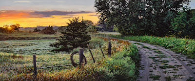
I really appreciate the opportunity offered by folks in our area, to allow me to have access and walk their properties. I'm not as big of a hiker as I once was but I still try when the opportunity arises. This property is one I'd hiked several times between 2008-2012. I still drive by there quite often and have done photography and artwork from the 'edges' on occasion.

This particular painting almost never saw the light of day. It was a beautiful and still summer morning...probably late August or very early September...judging by the vegetation I portrayed along the roadside edges. I remember there was a lot of ragweed present and that's how I painted it.

But as I said – it nearly never became a painting. Why? Well, even though I break my own rules sometimes, in general I don't usually paint a scene if my mind is set on recording it as a photograph from the beginning. I found myself on this small one lane dirt road at the SW corner of the owner's property and the sun was about to rise. I was in my old beater S10 pickup and climbed into the bed, as I often do – to gain a bit of elevation and perspective.

I had just bought a new camera...not a really expensive one but I had needed to replace my old Nikon D1X. The D1X was the flagship 'digital' Nikon that came out around 1999-2000. It had an “amazing” capability of 5.6 MP if my memory serves me correctly. Boy did things advance quickly after that! But I was still making calendar and magazine sales with that camera – it was top notch at the time. But 10-11 years later it was having issues and I had no choice but to become a camera consumer again...this new camera had 12MP, which was well over twice the old one...but nowhere near the head of the pack with all that were available then – but it was fine for me.

My new camera had good auto-focus capabilities and I was looking forward to that...these old eyes need any help they can get. Well, back to the pickup bed. I was setting up the tripod with my new camera and suddenly realized – I had totally forgotten my glasses! For crying out loud! I never had much trouble with 'distance', but closeup...looking through a lens or at the digital back screen – I was flying blind...big time Mr. Magoo...Then I though “Hey, this camera can be totally auto-focus, not to worry”!

I loved the composition of the scene before me, and the early light was great...the colors were just singing a song I couldn't get enough of! I wanted to catch the sun just as it broke the horizon and waited for it.

I set the tripod head to swivel the camera for 4 frames – I was visualizing a panorama and one frame just wouldn't do it. I could go heavy wide angle and get the panoramic view...but I'd have to crop a lot of stuff in the image to get what I was 'seeing' – and the size I wanted to output to (print) would have required too much enlargement of the small file to look decent. This is a camera technique I still use to this day – stitching several frames together can achieve a higher resolution for more demanding work.

But back to the camera...since my glasses were apparently still at home, I trusted the auto focus to do it's thing. It had worked at home the day before when I tried it out so I wasn't concerned...just still a bit disappointed in my dumb move. It was a great image – I was sure of it!

Well, I took the camera off and set the tripod over the side of the pickup bed and walked to the edge of the tail gate and hopped off onto the ground.

I remember just totally losing my vision to a bright flash of pain, then everything as quickly went black -it is hard to adequately describe. I came around and found myself on all fours just screaming in my head. “I shouldn't have done that.” went through my mind. Its like a traffic accident. You spend way too much time thinking back...trying to stop what had just happened. Needless to say – I didn't take any more pictures that morning.

The chiropractor saw dollar signs I'm sure when I limped with a cane into the office that afternoon. In all fairness I'm being facetious, but it was 2-3 appointments a week for a while and at least 6 months before I felt I had finally gotten through my injury.

But back to the pictures I took. To add insult to injury, when I brought the image files up on the computer – EVERYTHING was out of focus...fuzzy beyond salvation! OMG...in my nearsighted blindness, I just could not make out the small print on the camera controls – I was sure I had selected “auto-focus” but apparently had disabled it instead. Aaccck!!!!!!!

I was a mess to put it mildly...no one should ever be seen by another human being when they get like this. Poor Georgie!!! (She sure puts up with a lot, let me tell you!)

Its bad enough losing a productive day, but losing nearly 6 months to rehab on top of it makes it grimmer. I don't remember how much time passed, but one day when I was about to dump all the files from that morning, I thought “If I could just work through the out of focus mess – this would make a beautiful painting!”

I really do not remember how long it took to have this epiphany, or how long I kept tossing this idea back and forth in my mind, before I committed to trying – but I eventually tried. I started the painting in January of 2012...I figured if the Mayan calendar was right and the world was about to end – then, hey why not. (Ya, that was really a 'thing'.)

It took a bit of work re-imagining the 'near' objects – they were just 'blobs' of shapes; the back ground was a bit easier but still no cake walk...the color was still there and the tonal range of the image was very helpful. I hacked my way through and finished the painting the first week of February – I was sooooo happy with what was brought back from a total loss and very pleased how well it was carried out.

I should never have let go of this painting – I regretted it the minute I spent the check! Seller's remorse – we've all experienced it. But it went to a great home – an appreciative home...and made for a very nice share of return business from this first-time client from out-of-state. There's several silver linings – and complete flops in this one painting!

"Southwest Corner Fence Line Along the Jordan" - oil painting © Bruce A. Morrison

(from a private Vermont collection)

Friday, February 18, 2022

Archived Works Friday - No.4!

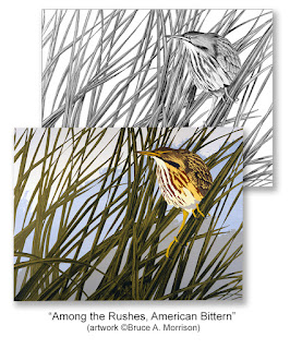
Post No. 4! The next post for "Archived Works Friday” comes as a pair from the mid 1980's. As I mentioned before - I'll post a painting, drawing or serigraph (silkscreen prints) from the "archive" files of years past...and give a little back story on the work. I hope you'll find it interesting!
 
Back in the 1980's I experimented with floating bird blinds; the kind you take pictures from. I took my first one out to a favorite marsh. it was a floating "bass buddy"...maybe I'm not getting the name right but it was essentially a nylon zippered slip cover that fit over an inner-tube, with a seat sewn in for the "occupant". It made a "bobber" out of the wearer! It was actually made for a fisherman to wade and float around on small ponds and fish from it...I guess the idea was to make you more mobile and get you out to where the fish were without a boat.
 
I got the brilliant idea that I could use it as a floating bird photography blind. I made a dome of chicken wire mesh and covered it in cattails which I tied to it - trying to imitate a muskrat hut. Great idea huh!???? I wore chest high waders and walked the blind out until I lost contact with the bottom, then just kind of bobbed around and "paddled" with my feet...took some getting used to but eventually made my way to a clump of reeds and anchored my feet around them to try and hold still.
 
It was kind of hit and miss that first try out on the marsh...muskrats would swim by and look at me like "what on earth!?". Thankfully none tried to “enter” the hut!!! An occasional Yellow-headed Blackbird would land on top of me - where I couldn't get its picture of course! The neatest encounter this first trip in the blind was an American Bittern - I had never been so close to one before! It was up clinging to the rushes trying to get a better look at this "thing" (my blind) - it was probably thinking "This wasn't here earlier!?". I did my best to get shots with the camera but it was difficult with the blind bobbing with every move I'd make.
 
This was back way before digital cameras. I didn't even have auto focus back then and shooting Ektachrome E-6 film that I'd process myself. The photos didn't turn out too bad. The Bittern's body was somewhat hidden by the reeds as it climbed along. As I looked at several of the slides I picked some out and created a composition from them - trying to portray the bird among the rushes without it's features being so obscured from view.
 
I first did a detailed pencil sketch, and was fairly pleased with it...but I was looking for something a bit more "graphic" in presentation and decided to do a serigraph (silk screen print) of it. I won't get into the details of that process this time, as its very lengthy. I had been accepted into the international "Birds in Art" exhibition the year before with a pencil drawing and thought I'd try entering again with a serigraph...I wanted to prove to myself that the acceptance the year before was not just a "flash in the pan".
 
The design was drawn directly on separate screens from the original pencil composition and broken down into solid colors...the exhibition deadline was fast approaching and I was having great difficulty registering colors and getting everything to look like I wanted. I finally managed to get one that I liked and hurriedly got it entered in time for the deadline.
 
It was accepted! I was over the moon and beside myself... once again being included in the prestigious international Bird Art exhibition "Birds in Art". Rubbing shoulders with artists from every continent was very humbling - I could see how far I had to go to even measure up to what work I was seeing.
 
As a side note on my maiden voyage on the marsh - when I had been out on the water, the wind had come up from the south and soon I had white caps! I was a good 100-150 yards out from shore and the wind was taking me to the other side of the marsh! It took all of an hour, or more to fight my way back to the landing. Completely played out, I drug myself into the car and turned on the radio - it was giving high winds/watercraft warnings for the day! NO KIDDING!!???
 
I revised my "floating blind" design - used marine plywood with foam filled pontoons, a lighter camo covered chicken wire frame that sat on top, and a platform for a tripod "head" to affix the camera and lens...so much better! (and safer) Still have it today...hanging out in the studio shed. Just need the time and "energy" to take it out again into the marshes...sounds like "The Old Man and the Sea" revisited to me!
 
"Rush Lake, American Bittern - Study" - pencil drawing - ©Bruce A. Morrison (from an Iowa private collection)
 
"Rush Lake, American Bittern" - serigraph - ©Bruce A. Morrison (from the Permanent Collection of the Leigh Yawkey Woodson Art Museum, Wausau, WI)
 
(These and other archived artwork can be viewed at - https://morrisons-studio.com/archived-works/ )
 

Saturday, February 12, 2022

Archived Works Friday! (Uh...Saturday!)

 
The next post for "Archived Works Friday” is a color pencil drawing from 37 years ago. As I mentioned before - I'll post a painting, drawing or serigraph (silkscreen print) from the "archive" files of years past...and give a little back story on the work. I hope you'll find it interesting! 
 
Hardly any of us are strangers to color pencils...who didn't play with them as kids...they were less messy than crayons, but not as color filled with contrast and pigment as crayons were. The color pencils “of old” had wax based pencil leads and broke very easily, nearly impossible to erase and hard to get some “punch” out of!
 
My first (semi serious) attempts at color pencil were of birds of prey...I believe it was a Peregrine Falcon on a cliff above a waterfall or something like that. I have lost a clear memory of it – maybe out of self preservation! I do remember exhibiting it and some others at the first Ft Dodge sidewalk art fair when I was around 12 years old. 
 
Years later I became aware that this “second class” medium was getting more attention. People were really starting to do some impressive work with them; and the pencils themselves were a much higher quality and even more permanent than they had ever been years back. I started experimenting with them and found they were “fun”! 
 
In the mid 1980's (and earlier) the state and national conservation stamps had become all the rage and artists were going out of their way to enter into the competitions for them. The Federal Duck Stamp was the holy grail. These “stamp” artists and contests even made their way into American lore in the 1996 movie “Fargo”, where a pregnant police woman from Brainerd, MN is bent on solving some murders, while her husband stays home entering duck stamp competitions. Ha! Funny stuff for such a dark comedic crime thriller!!!
 
I decided to try one of Iowa's conservation stamp contests in 1985...I was fond of fly fishing and decided I'd do a Brook Trout, since they are actually native to the far NE Iowa cold water streams. The Iowa Brookies are pretty small delicate trout, matching the small spring fed streams they originate in. I, in all my “great wisdom” (ha!!!!) decided I'd make my Brook Trout a real hog and impress the judges! (Oh boy...where was my head?) Anyway, I decided to do the Brook Trout in color pencil, as I was getting pretty confident with this medium.
 
On the day of the Iowa Conservation Stamps Judging in Des Moines, we decided to go down and actually witness it! This was pretty exciting stuff for us “wannabe stamp artists”!!! When the Trout Stamp entries were shown I searched all through the images to find mine (of course) and was horrified! They hung mine up “SIDEWAYS!!!!” Auuughhhh! I could not say anything as the judges were not to know the identity of the artists (no artwork was signed on the front). After anguishing over what had happened, and as the judges were finishing their deliberations – another artist across the room pointed out that they had a picture hanging sideways – (THANK YOU!!!)...leave it to an artist to recognize something so obvious to any “SANE PERSON”!!!
 
The judges all stepped over to my drawing...one of them reached out and turned the picture upright...they talked among themselves for half a minute maybe, turned around and announced my big fat Brookie as the selection for the Iowa Trout Stamp for 1985!!!!
 
This comedy of errors was transferred to the actual stamps when they were printed...I was again horrified when I received my stamps to sell with my prints – they were printed WRONG! I did NOT want to sell sideways stamps with my prints and contacted the Iowa DNR. Well...they would not reprint the stamps -there were 30,000 of them! BUT...after a bit of soul searching they agreed to reprint 300 the correct way so each of the 300 prints in my limited edition would have a correct one...I had to make an agreement that the only way someone could buy a correct stamp was to buy a print...how much dumb luck can I wrap myself in!!!!???? It was just nuts. 
 
It soon hit the news across the country that 30,000 1985 Iowa Trout stamps had been incorrectly printed and “ONLY” 300 had been printed correctly! I was busy for a couple weeks shipping prints and correct stamps everywhere across the country and even got into a bidding war over the original drawing. It was almost as crazy as a movie, but without murder and mayhem – thank goodness!!!
 
I've stuck with color pencils ever since – only the modern ones are like day and night compared to those of those crazy days in the 80's and earlier!
 
(This drawing and other archived artwork can be viewed at - https://morrisons-studio.com/archived-works/ )
 
"Brook Trout – 1985 Iowa Trout Stamp" – color pencil drawing - © Bruce A. Morrison
(from a California private collection)